Chat
Client
CA Technologies
Agency
John McNeil Studio
Year
2016
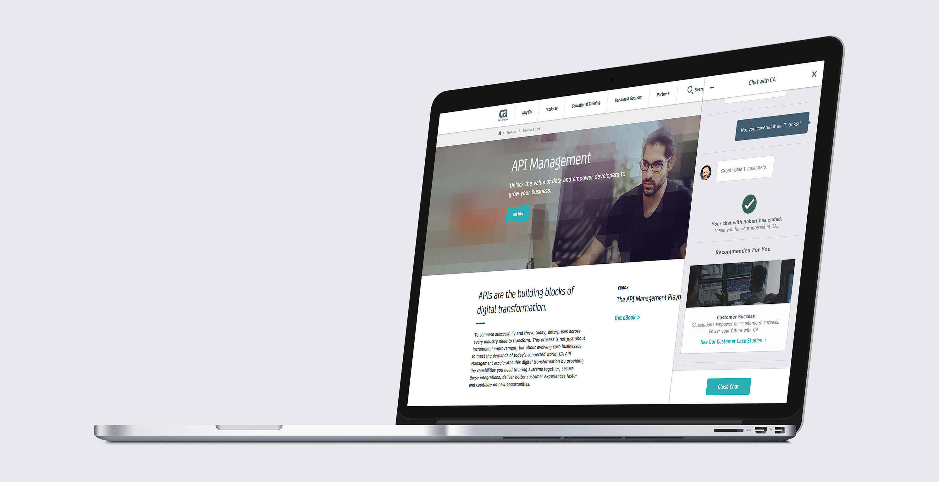
Chat is a feature that connects users to experts within CA Technologies. This feature helps users get support for their technical problems. This was a two week project from creating wireframes and defining the user experience, to designing the visuals and prepping the files for hand-off. This feature is available on both mobile and desktop from CA Technologies site.
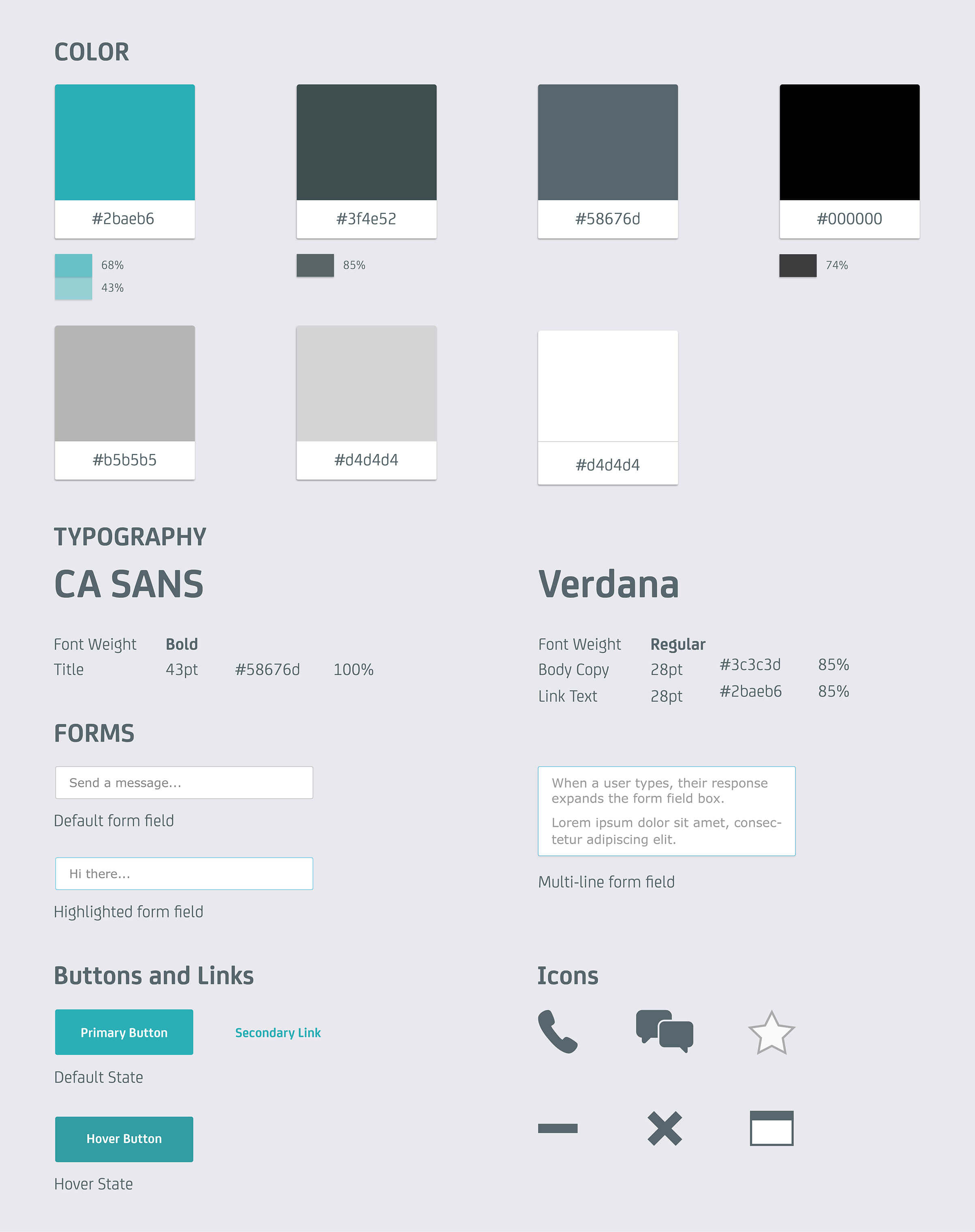
I worked with the senior art director on the experience and visuals for this project. I brainstormed and researched current support chats on common interactions, functionality, responsiveness from desktop to mobile, etc. With that, I used CA Technologies existing ui and applied it to this product. Through various iterations and client feedback, we finished this project within two weeks of development.

Challenge:
- Easy Navigation
- Quick ability to complete task
- Designing interface on-brand
Overview: Creating a chat feature that is easy to use so that people could get the information they wanted quickly. This feature had to work responsively on mobile and desktop, with the current branding guidelines.
Solution:
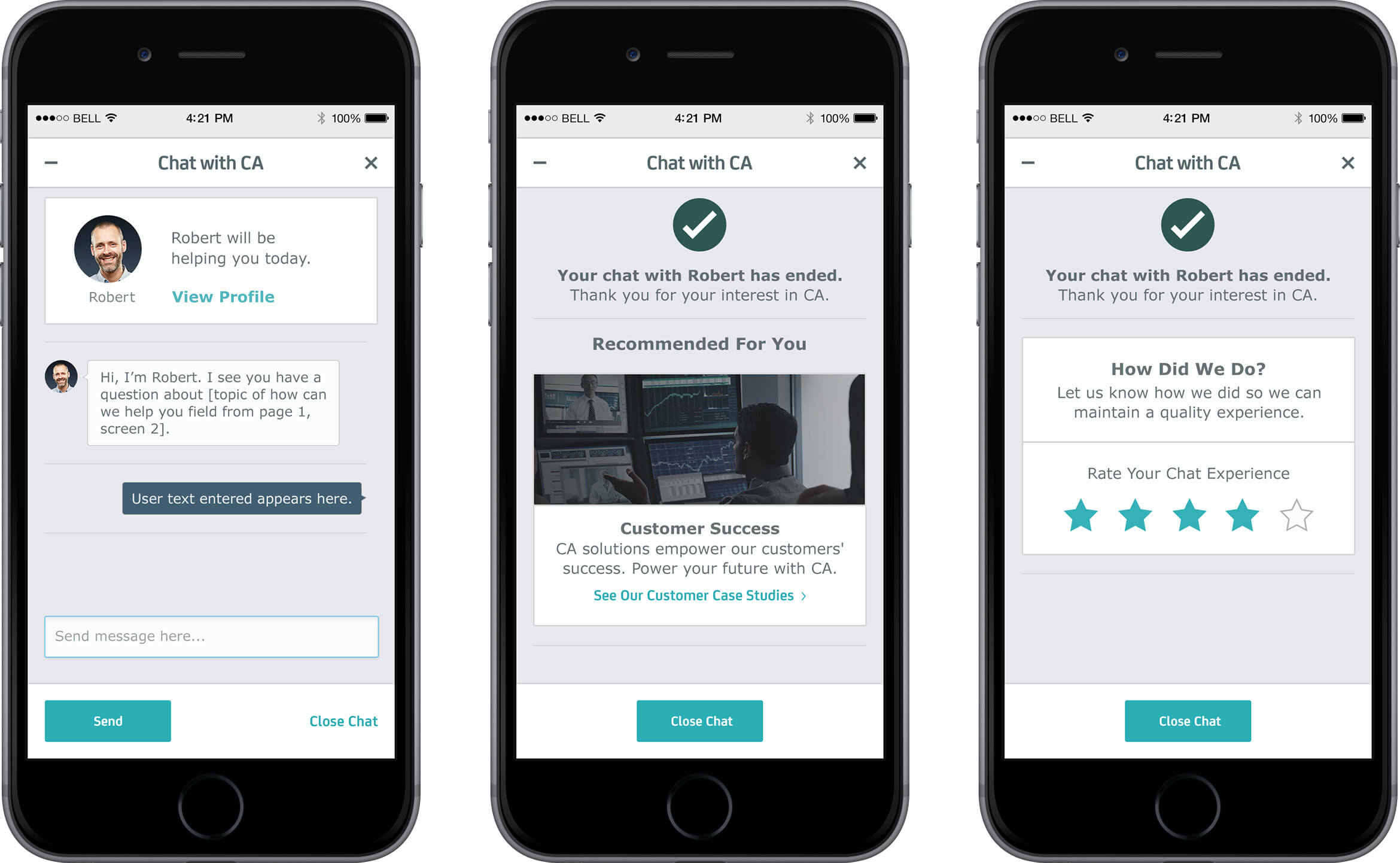
A sticky side nav that would slide out for the desktop viewing of the feature. It is the best solution because you would always be able to see the icons when browsing throughout the site, so help would be easy to find and accessible. In this way, you could still be on your current webpage while chatting online, or getting contact info (over phone or email). The chat would look like speech bubbles with assigned colors towards each person, which imitates the common look of texting. These chat bubbles also help separate the conversation, which is helpful when scrolling through long dialogue. Through various tasks, the person could be sent different viewings depending on their initial contact (chat being time-dependent). Ideally, the user would want to use the feature within the designated available hours, but if not, they would fill out a form so that they could get help immediately once available. Overall, this feature has simple flows that help guide the user in getting the right person to answer their question(s).


User Flows:
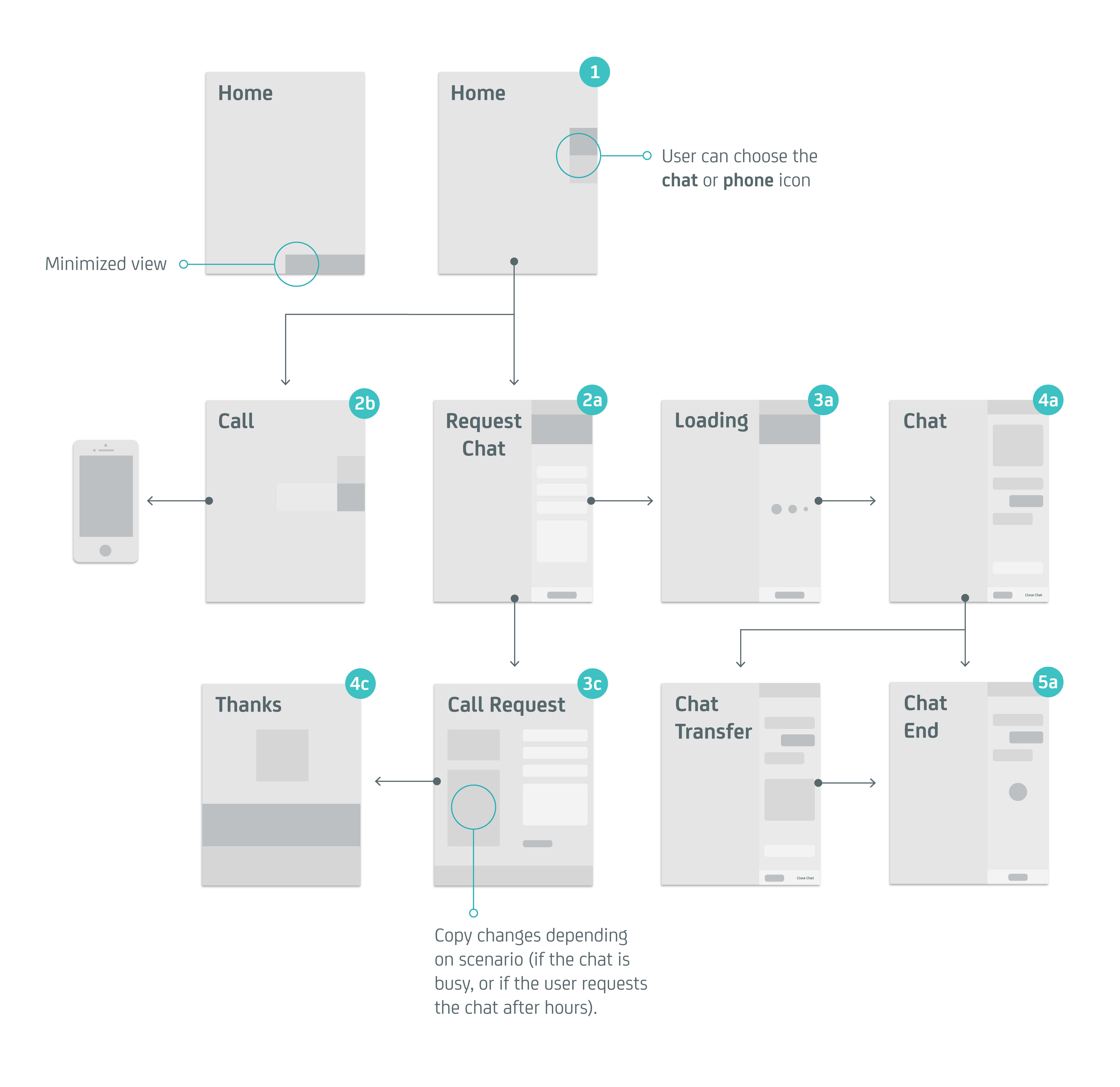
Scenario 1
User clicks on chat and is able to communicate with someone immediately. They ask their question and has it answered. Chat ends.
Chat Icon is clicked -> Requests Chat -> Page loads -> Chat Starts -> Chat Ends
Scenario 2
User clicks on chat and is able to communicate with someone immediately. They ask their question and it wasn't answered. They are transferred to someone who can better assist them. They get their answer. Chat ends.
Chat Icon is clicked -> Requests Chat -> Page loads -> Chat Starts -> Chat Transfers -> Chat Ends
Scenario 3
User clicks on chat and is unable to communicate with someone as it's after hours. They are directed to a webpage with forms. They can leave their info to get contacted once someone is available during hours. After completing the form, they're taken to a confirmation page saying that their information has been sent.
Chat Icon is clicked -> Forms Page -> Confirmation
